2 Google Fonts Similar to Apercu

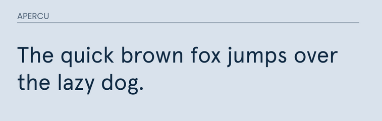
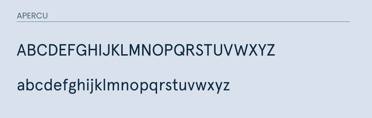
Apercu is a sans-serif font created in 2010 by Colophon. It was inspired by Gill Sans, Franklin Gothic, and other similar fonts. It works well for both body text and headlines.
After digging through the Google Fonts library, I was able to find two decent alternatives for Apercu.
Quick Disclaimer, neither of these fonts will be an exact match. Instead, they are similar in nature and share many of the same characteristics. So if you are in a position to do so, I would recommend purchasing the font.
However, if your project is on a budget. Then either one of the fonts mentioned below will work.
What Google Font is Similar to Apercu?
The best Google Font alternatives for Apercu are:
- Lato
- Cabin
Either one of these would work as a decent replacement.
So let's cover some of their differences and similarities.
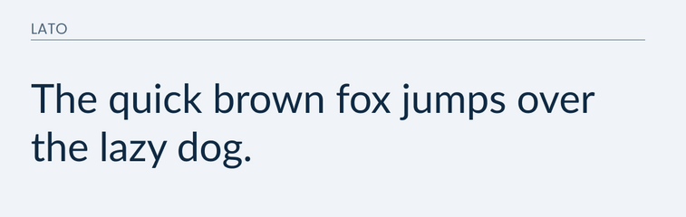
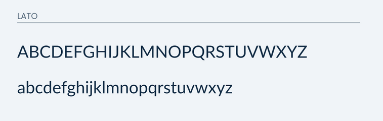
Lato
Lato is a classic sans-serif available on Google Fonts.
Although it is not exactly like Apercu, it does feature some similar traits, especially in lowercase. It does a great job in matching many of the lowercase letters, and makes a valid attempt in trying to match that lowercase "g".
In the uppercase is where you start to see some of the differences. The main difference is in the width of the letters. Many of the letters are much wider in Lato.
You will also notice some big differences in the uppercase "M", "Q", "J", and "G".
Go ahead and compare below
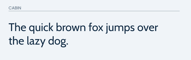
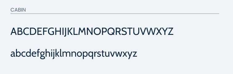
Cabin
Cabin is another great sans-serif font available in the Google fonts library.
It also does a great job in trying to match all of the lowercase letters. However, you will notice some differences in the "u", "l", and "g".
The uppercase is where things get difficult. I would not recommend using Cabin as an alternative if the majority of your design is using uppercase. There are many differences that truly make it it's own font.
Compare below.
Final thoughts
Overall, I believe that Lato is probably going to be your best bet. It works the best for both uppercase and lowercase. Cabin would make another ok alternative if the majority of your letters are in lowercase. Otherwise, I recommend just sticking to Lato.