2 Google Fonts Similar to Cerebri Sans

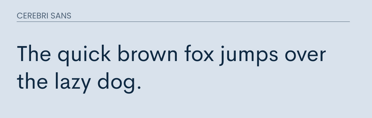
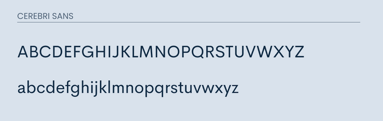
Cerebri Sans is a soft and elegant sans-serif typeface. It was inspired by geometric and grotesque typefaces. It is warm and approachable. It makes a great font for headlines as well as long form web content.
Due to these reasons is why it is becoming such a popular font.
It was difficult finding a really good alternative on Google Fonts for Cerebri Sans. However, I believe that I have two decent alternatives that will work for those needing a similar font.
What Google Fonts are Similar to Cerebri Sans?
The best Google fonts that are similar to Cerebri Sans are:
- Lato
- Open Sans
Either one of these fonts will work as a good alternative.
So let's cover some of their differences and some of their differences and their similarities.
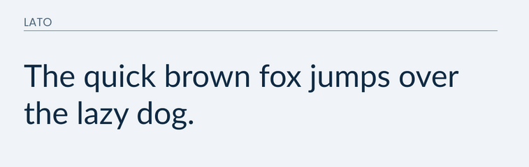
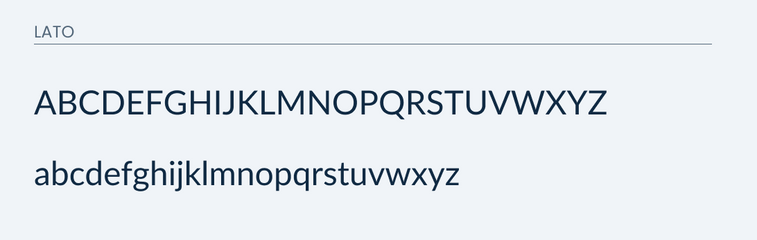
Lato
Lato is a very popular sans-serif font that is available on the Google Font library.
It does a great job matching the majority of the letters in Cerebri Sans. I would argue that it is about a 90% match.
However, the main difference that you will run into is going to be the lowercase "g". It is major difference within the lowercase letters. There is also a slight difference in the uppercase "Q".
I made a few images for you to compare for yourself.
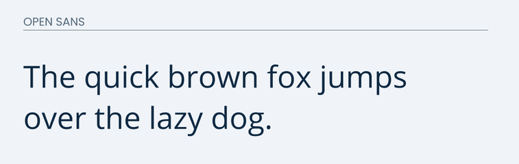
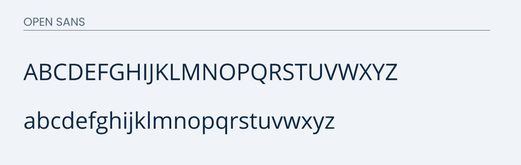
Open Sans
Open Sans is a sans-serif typeface that represents neutral and friendly design. It is also another super popular sans-serif font that is available in Google Fonts.
It also does a great job in matching many of the letters that Cerebri Sans has. Just like Lato, the lowercase "g" sticks out like a sore thumb.
The other difference you will see is that some of the letters such as the "O" and "Q" are more oval in open sans.
Take a look below.
Final Thoughts
Overall, Lato will probably be your best bet as a decent alternative. Neither one of these is going to replace the actual font itself. So if you are in a position to do so, I would recommend purchasing the font itself and supporting the creator.