2 Google Fonts Similar to Frutiger

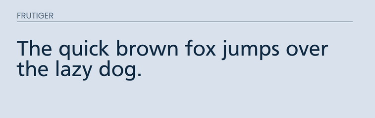
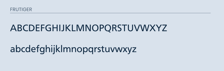
Frutiger is a sans-serif font created by Adrian Frutiger in 1968. He was commissioned to create a font that would work on signs for the Charles de Gaulle airport. Each character was designed to be easily recognized. Over recent years, this font has transitioned to magazines and books.
Luckily within the Google Fonts library there are a few similar looking fonts. After searching through all the fonts, I have found two similar looking fonts to Frutiger.
I believe that either one of the fonts below would make for a decent replacement if your project is on a budget.
However, nothing is going to replace the actual font itself. So if you are in a position to do so, I recommend purchasing the font from the creator.
What Google Fonts are Similar to Frutiger?
The most similar looking fonts to Frutiger that are available in the Google Fonts library are:
- Istok Web
- Roboto
I believe that either one of these fonts would make for a good alternative. So let's jump into the differences and similarities.
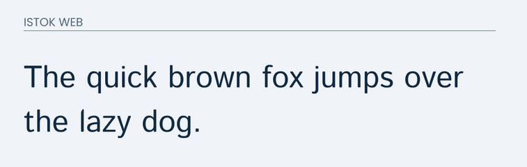
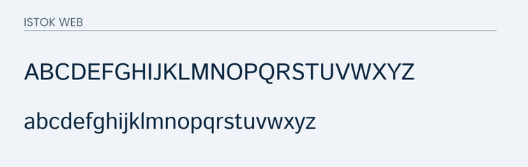
Istok Web
Istok Web is a modified version of Istok. It is an easy to read font available in the Google Font library.
Istok Web is very similar to Frutiger, especially in the lowercase. They are very close matches. You will see some small differences. For example, the dot in the both the "i" and "j" is more square in Frutiger versus a circle in Istok Web.
The uppercase is also very similar with a minor difference in the "Q" and "G".
Go ahead and compare below.
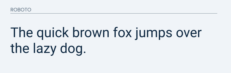
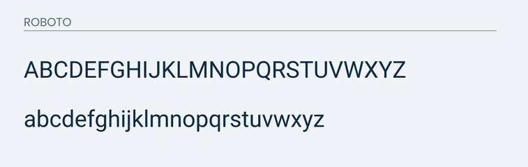
Roboto
Roboto is a very popular sans-serif font available in the Google Font library.
It also share many of the same characteristics that Frutiger has. It is easy to read and friendly.
Both the uppercase and lowercase are very similar. The lowercase runs into the same problem where the dots in both the "j" and "i" are circle instead of squares. Otherwise on lowercase their are nearly identical.
Uppercase is also very similar. However, you will see that the difference is in the shape of the "O" and "Q". Frutiger is rounded versus Roboto is more of an oval shape.
Final Thoughts
Either Roboto or Istok Web would make for a good alternative in place of Frutiger. As you can tell, no free option is going to work as an exact replacement. So, if you can, I recommend purchasing the font. However, if your project is on a budget then either one of these fonts would work.