2 Google Fonts Similar to Gill Sans

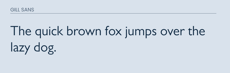
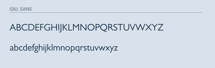
Gill Sans is a sans-serif font that can be traced all the way back to 1928 when it was created by Eric Gill. The font is known for it's unique capital R and it's hourglass shaped lowercase g.
The font is modern and easy to read. This makes it a great font for both web and print material. It comes in 15 different styles which means it can easily be used for body paragraph text or headlines. This is what makes it such a popular font.
As usual, lets dive into the best alternative fonts to use in case you are on a budget.
What Google Fonts are Similar to Gill Sans?
The fonts that are closest to Gill Sans from the Google Fonts library are:
- Cabin
- Lato
These two will be your best bet in finding a free alternative to Gill Sans from Google Fonts.
Let's dive into eat one so you can get a better idea.
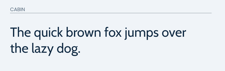
Cabin
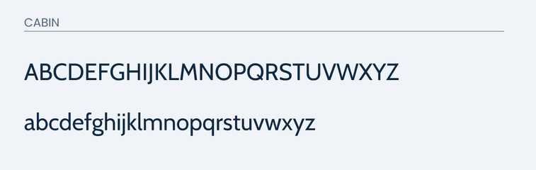
Cabin does a great job of matching many of the distinct features in Gill Sans. The "g" in both are very similar. This is always a hard feature to match since it is so unique in Gill Sans.
This typeface also closely matches the "a" and the "t" very well.
The most biggest difference is the uppercase "R". The "R" in Gill Sans is extremely unique. It features an extended bottom leg that stretches out. So this will be a big difference that you will run into.
Also the "Q" is slighlty different in Gills Sans because the tail comes more from the bottom middle of the circle. While the "Q" in Cabin shows more of a straight light piercing through the circle of the letter.
Overall, everything else is very identical.
You can check it out for yourself below.
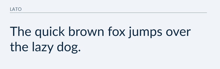
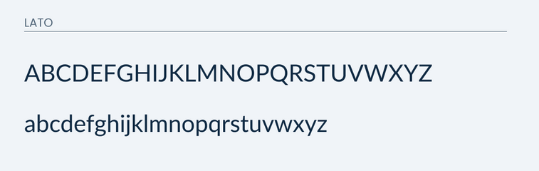
Lato
Lato is another great font that can closely match some of the unique features in Gill Sans. It will also closely match the "g".
Lato also closely matches the "a", "y", and "j". It gives off the same feeling and vibe that Gill Sans does, but it does have some differences.
The uppercase "R" is also a problem with Lato. It doesn't match the uniqueness that is featured in Gill Sans. There are also subtle differences in the "b", "p", and "d". In Lato, they feature little indents where to loop hits the vertical line. However, in Gill Sans that indent in non existent.
This typeface is not a perfect match, but it generally will get the job done.
Take a look at the images to see for yourself.
Conclusion
Both Lato and Cabin would make good alternatives for Gill Sans. Although they don't match exactly some of it's unique characteristics. They do closely resemble each other and would be a great alternative instead.