2 Google Fonts Similar to ITC Avant Garde Gothic

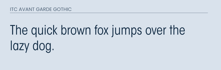
ITC Avant Garde Gothic is a sans-serif font that was originally designed for just a logo. Due to it's popularity, the designer decided to expand it into it's own typeface. This family contains 5 different weights and works well with body text and headlines.
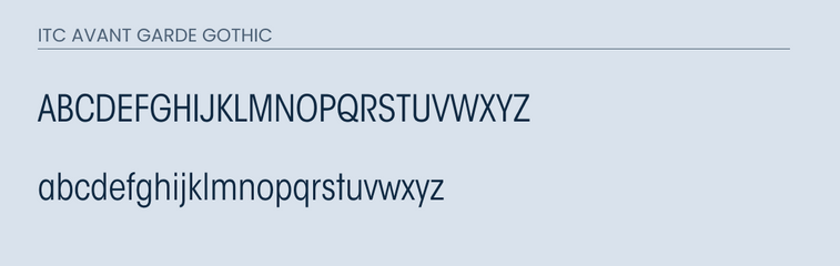
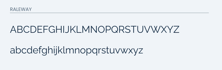
This typeface has a really unique style. The letters are very narrow which makes it hard to find an exact match.
However, I believe that I have two fonts that can match the letters pretty. Either one of the fonts would make for an ok alternative, but nothing replaces the actual font itself. So if you are in a position to do so, I recommend purchasing the font from the creator.
What Google Fonts are Similar to ITC Avant Garde Gothic?
The most similar looking fonts to ITC Avant Garde Gothic from Google Fonts are:
- Raleway
- Poppins
Either one of these fonts would make for an ok alternative. Below, I cover what they have in common and their differences.
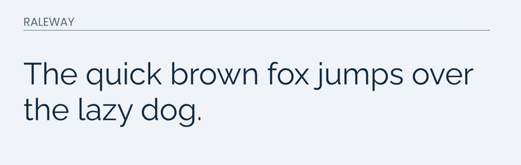
Raleway
Raleway is a sans-serif font that people described as elegant. It is professional, but still fun and welcoming. It was initially designed by Matt McInerney, but the font was later expanded with the help of other designers.
If the letters were to be made more narrow with some photoshop magic, I believe that it would make for a decent alternative.
It does a pretty solid job in matching the uppercase letters and lowercase. However, if you look closely you will notice some differences in the lowercase "t", "l", and "k".
In the uppercase, the major difference is in the "Q". It is a very unique "Q", so it is hard to match.
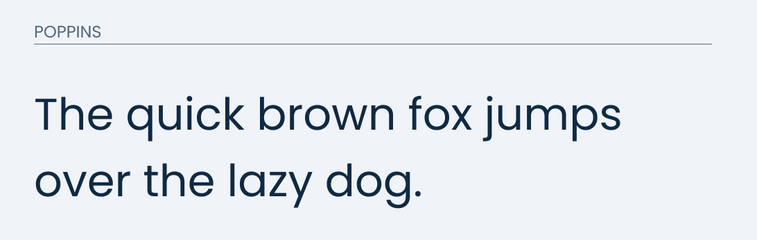
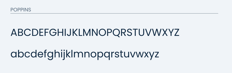
Poppins
Poppins is a great boldish sans-serif font used by many. It also closely resembles the format of the letters in ITC Avant Garde Gothic.
I imagine that if you can make the letters more narrow in photoshop, then it will be a similar look and feel.
It matches both the lower and uppercase letters very well. You will find some differences in the uppercase "Q". Like I said before, that letter is very unique and will be very difficult to find a good match for.
Compare below.
Final thoughts
This font is a very difficult one to find a good alternative to. It is very unique and no font naturally from Google Fonts is going to match it. However, I believe that if you were to make Poppins a little more narrow, then you would have a fighting chance.