3 Google Fonts Similar to DIN

DIN was first created in 1931 and was used for traffic signs through Germany. It was actually created by an engineer instead of a designer. Later in 1995 it was updated by Dutch designers Albert-Jan Pool. Overtime, people became more aware of it and started using it on the web.
Some good similar fonts that are not on google are Gidole, Alte Din, and D-Din. However, in this article I will cover fonts that are similar from Google Fonts.
What Google Fonts are Similar to DIN?
The most similar fonts to DIN on Google Fonts are:
- Roboto
- Cabin
- Barlow
Any one of these would make a great alternative to the DIN.
So lets take a deep dive into each one to highlight their similarities and differences.
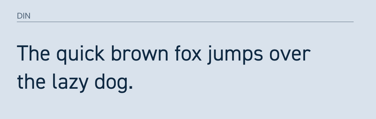
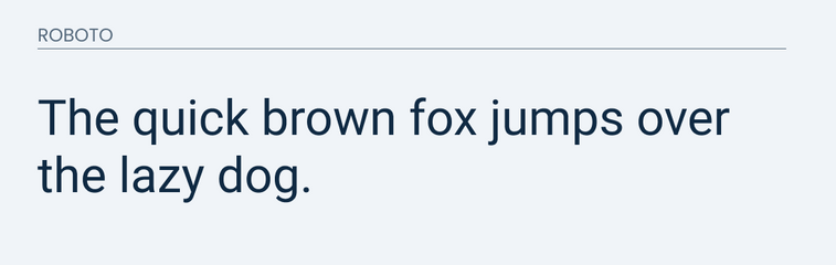
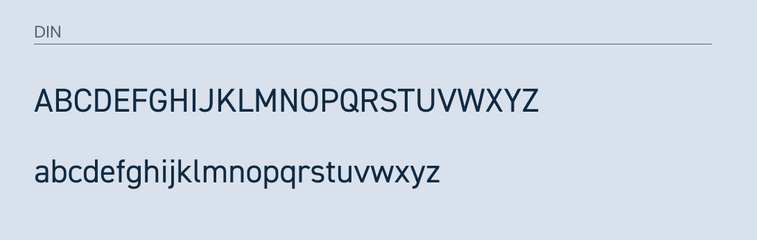
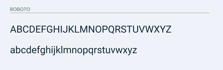
Roboto
Roboto, in my opinion, is the most similar font on this list. It's letters are largely geometric and easy to read.
It does an excellent job at matching 98% of the lowercase letters. However, you will notice a slight difference in the lowercase "l".
The same goes for the uppercase. Most of the letters that I see are the same expect for the "Q". Roboto features more of a tail while DIN have a line that goes straight through it.
I would say the main difference is in the width of the letters. DIN is shorter in width and more condensed.
I prepared some images for you to compare for yourself.
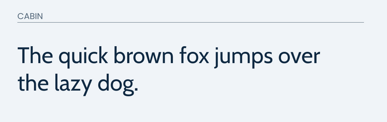
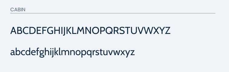
Cabin
Cabin is another great font that would work as an alternative. Cabin is great because it has a touch of modern, but is still friendly and approachable.
I feel that they both have a similar look and feel. The main difference you will find right away is in the "g". DIN has a more traditional "g", while Cabin has a two loops sitting on top of each other.
Cabin does do a great job matching the little curve on the lowercase "l".
In the uppercase, it does.... ok. The major difference is in the width of the letters. DIN features many letters that are more of ovals than circles when it comes to it's "O" and "Q". This makes for a major noticeable difference.
So I would recommend Cabin if you are mainly using lowercase letters.
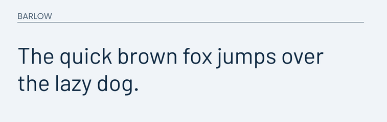
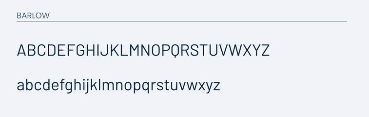
Barlow
Barlow is last of my list because it does a great job making up for some of the parts that Cabin misses.
For example, Barlow matches those oval shaped letters very well. It even matches make of the same letter shapes very well.
Some of the letters are a little bit wider, especially the uppercase "J". Overall it isn't a bad option because Barlow was made with Calfornia's highway signs in mind. This is very similar to DIN because it too was made for highway signs in Germany from 1931 to 1936.
Feel free to compare for yourself.
Final Thoughts
I feel that Roboto will be your best bet. However, if you want more focus on narrower letters then Barlow or Cabin will be a great option.