3 Google Fonts Similar to Gotham

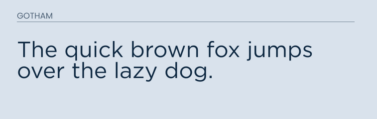
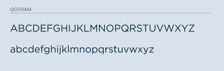
Gotham is a sans-serif font created in 2000 by Tobias Frere-jones. The font became popular since it was used in the Obama presidential campaign.
It is known for having a large x-height and apertures. This font is great for headlines and titles. There are many alternatives out on the market, some of which are free. However, if you want the actual font itself you will have to buy it straight from the maker.
Luckily, I was able to find some similar looking fonts on google fonts. They are not exact, but pretty close!
What Google Fonts are Similar to Gotham?
The fonts that I found that are most similar to Gotham are:
- Montserrat
- Open Sans
- Lato
As always these fonts are available to the Google Font api so they are free to use for your next design project.
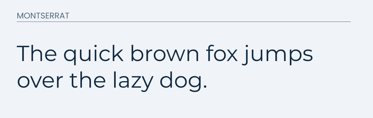
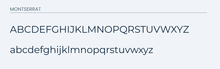
Montserrat
Montserrat is a sans-serif font inspired from old posters and signs in the old Montserrat neighborhood. This typeface represents an beautiful urban typography that came around in the first part of the twentieth century.
It makes a great font for both headlines and paragraph body text. This font comes in a full set of font weights to fit any situation you need.
This font is the most similar. It it's lowercase form it is almost identical.
There are some very minor differences on closer inspection. For example, the "m" is a little wider in Montserrat vs Gotham. Overall it would make a great replacement font for it.
See for yourself!
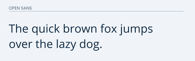
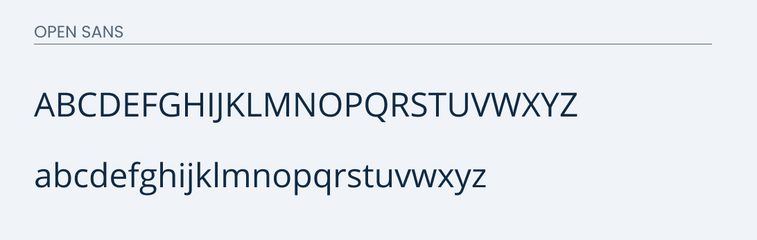
Open Sans
Open Sans is a sans-serif typeface that represents neutral and friendly design. It should mainly be used for body paragraph text, but could be used for headlines as well.
Open Sans and Gotham are also very similar to each other. The letters are easy to read, friendly, and approachable. They both feature a unique stubby "j" and "f".
The major difference is in the "g". The "g" in Open Sans features two loops on top of each other. This would be a dead giveaway that it is not Gotham. However, if you are wanting a similar appearance then Open Sans would be a great alternative.
Here are some examples.
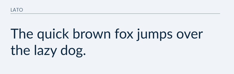
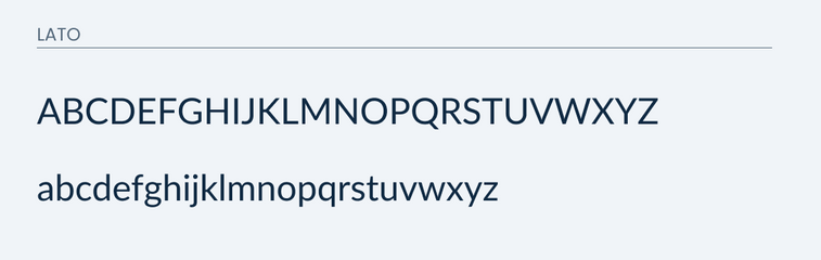
Lato
Lato is a great, easy to read, sans-serif typeface. It features classic proportions that make it great for titles in uppercase.
Many of it's letters feature similar characters to that of Gotham with a few differences. They share a similar look and feel, but the main difference is in the "g" and "y". The "g" in open sans features two complete loops on top of each other and the "y" is without the tail swooping on the bottom stroke.
This is why it would be my third pick. It would make for a great alternative if neither Montserrat nor Open Sans works.
Take a look.
Conclusion
Gotham, fortunately, has some really good Google Font alternatives. Montserrat is going to be your best bet. However, if that one doesn't work for you then, Lato and Open Sans are both great alternatives.