3 Google Fonts Similar to Museo Sans

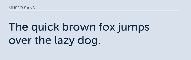
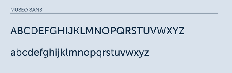
Museo Sans is a sans-serif font created by Jos Buivenga. It is known for it's low contract, geometric design. It was designed for web and mobile. The font includes 5 different weights which makes it a great pick for either paragraph text or headlines.
While searching for a Museo Sans alternative, I came across one really good one and two the might work if you squint you eyes enough.
As usual, these are just suggestions. They never will replace the actual font itself. So if you want a real specific design, then I recommend just purchasing the font and supporting the creator.
However, if you are on a budget, then here are 3 great Google Font alternatives to Museo Sans
What Google Fonts are Similar to Museo Sans?
The best Google Fonts that are Similar to Museo Sans are:
- Raleway
- Muli
- Montserrat
These were the closest fonts that I could find.
So lets cover what they have in common as well as their differences.
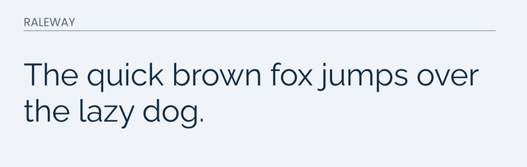
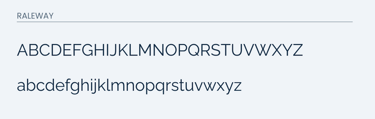
Raleway
Raleway is a great free to use font on Google Fonts. It is described as elegant and professional.
I have found this font to be the closest to Museo Sans. It matches almost every letter in both uppercase and lowercase. This is rare.
You will notice some minor differences when you really pay close attention. For example, the lowercase "g" in Raleway is a little wider than the "g" in Museo Sans.
However, this minor difference would require someone to really be paying close attention. If your goal is to have a similar look and feel then Raleway would be a great option.
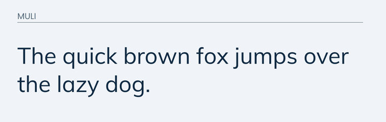
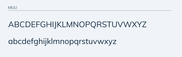
Muli
Muli is another great alternative for Museo Sans. It is easy to read and friendly. It recently had a name change to Mulish and to my knowledge they are the same typeface.
The lowercase for Muli matches the lowercase for Museo Sans pretty well. The main difference are in the "a" and "y".
In Museo Sans, it features more of a curve on the bottom piece. While in Muli, it is more straight.
The uppercase is also pretty similar but you will notice a big difference with the uppercase "K" and "G".
The uppercase "k" in Museo Sans is pretty unique in the fact that it features a more curved upper line. In Muli, it is a more traditional straight lined "K".
Go ahead and take a look for yourself.
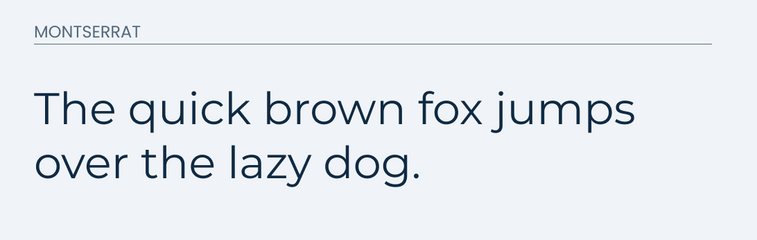
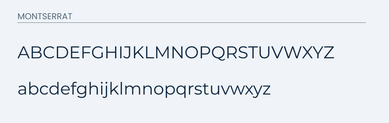
Montserrat
Montserrat works as a great lowercase alternative for Museo Sans. It is much like Raleway where it is able to match the lowercase almost completely.
The uppercase is a little different. It does a poor job in matching the "Q", "K", and "G".
You can quickly see that the unique "K' in Museo Sans is replaced with a more straight lined traditional "K" in Montserrat.
The "G" in Montserrat is also strikingly different that the "G" in Museo Sans. The "G" is much more bare in Montserrat.
Go ahead and compare for yourself.
Conclusion
As usual, these are recommendations that can be used as good replacements. However, nothing will beat using the actual font. So if you are on a tight budget, then either one of these would be a good look alike, but if you are in a position to do so. Then I would recommend purchasing the font.