3 Google Fonts Similar to Neue Helvetica

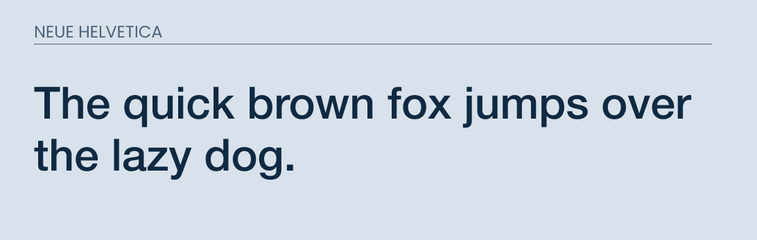
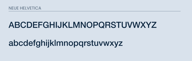
Neue Helvetica is a redesign of it's older brother Helvetica. The newer version improves upon legibility, has heavier punctuation marks, and improved spacing in the numbers.
This font was designed to be bold, approachable, and easy to read.
This makes it great for both web and print. It has 51 different font weights and is used in multiple languages.
With all of this, it is no wonder why this is such a popular font.
For those who are on a budget, you may want to find a free alternative.
What Google Fonts are Similar to Neue Helvetica?
Here are the fonts that are available on Google Fonts that are similar to Neue Helvetica:
- Roboto
- Open Sans
- IBM Plex Sans
These are fonts are similar in nature and share many similar characteristics. So lets cover their similarities and some of their differences.
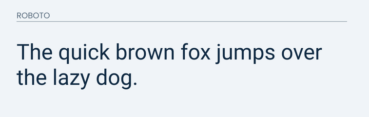
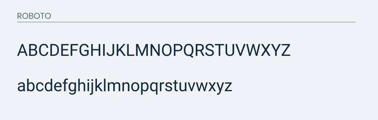
Roboto
Roboto is going to be one of the closest fonts to Neue Helvetica. It is most similar on this list. It does a great job matching the "a" and "g". It features the swooping tail on the "t" and nicely imitates the indents on characters such as "p", "d", and "b".
This font is going to be the most similar. The only difference that I noticed was the uppercase "Q" and "G".
In Roboto, the "G" misses the downstroke that is featured in Neue Helvetica. The "Q" has more of a tail rather than a line drawn straight through it.
These differences in minor and only someone who is paying close attention will pick up on the differences. This is why I recommend using Roboto as an alternative to Neue Helvetica.
You can check out the differences below.
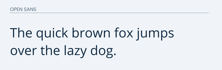
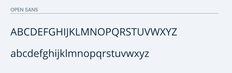
Open Sans
Open Sans is another great Google font that is similar to Neue Helvetica. The "y", "a", and "t" are basically identical. Those are normally where fonts start to differ.
It is about 85% similar.
The major differences lie in the "g" and uppercase "Q". The "g" in Open Sans features two circles on top of each other while the "g" in Neue Helvetica is a loop with a swoosh on the end.
While the "Q" features more of a tail in Open Sans, rather than a straight line through it.
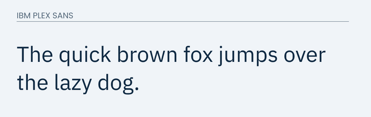
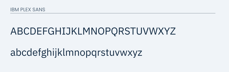
IBM Plex Sans
IBM Plex Sans works well as an alternative to Neue Helvetica. It is the third on this list because it is the least identical compared to the other two. However, it is one of the fonts on Google fonts that is most like it.
The major difference with IBM Plex Sans is that it is a little more blocky while Neue Helvetica is more curved.
The letters are similar, but you will find the main difference in the lowercase "g". It is much like Open Sans where there are basically two circles that sit on top of each other.
Compare for yourself.
Conclusion
Overall, Roboto would be a great choice to use. It is a super popular font that fits many different themes. Open Sans and IBM Plex Sans are also great options if Roboto doesn't work for you.