4 Google Fonts Similar to Proxima Nova

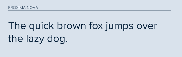
Proxima Nova is a rework of Proxima Sans. It is a good inbetween font for Futura and other classic sans faces. It features a nice middle ground geometric appearance. It is a very popular web font because of how it looks on digital displays of all sizes.
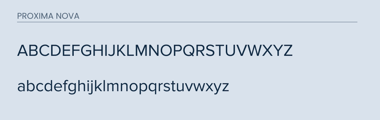
Finding similar fonts to Proxima Nova can be a little challenging. It features a slightly curved bottom "t", a semi-closed "f", and a nice rounded bottom lower case "a".
These are some of its distinct features that make it difficult to find an exact match.
However, I was able to find 4 fonts that were pretty similar and would make great alternatives for Proxima Nova.
The best part is that they are all available on Google Web Fonts.
What Google Fonts are Similar to Proxima Nova?
The best fonts to use instead are:
- Montserrat
- Nunito Sans
- Muli
- Open Sans
So let's take a deep dive into each one.
Montserrat
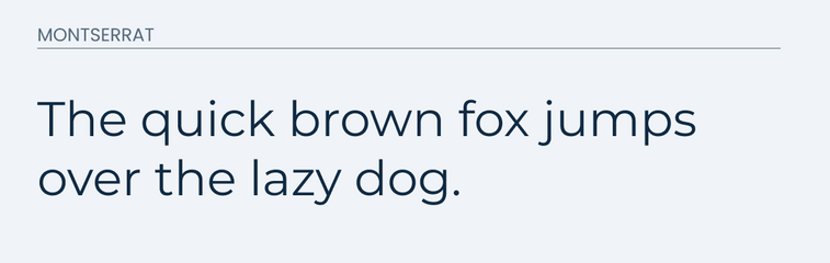
Montserrat is a clean and easy to read typeface. It makes great body and paragraph text and comes with many different weights giving you lots of different options.
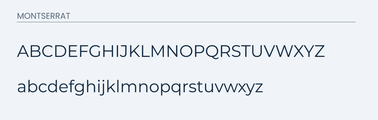
Montserrat is one of my favorite alternatives to Proxima Nova because it matches the same lower case "t" and it has a close enough lower case "a".
One of the big differences is the "y". In Montserrat, it has a longer tail at the end in it's lower case form.
Take a look for yourself.
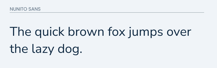
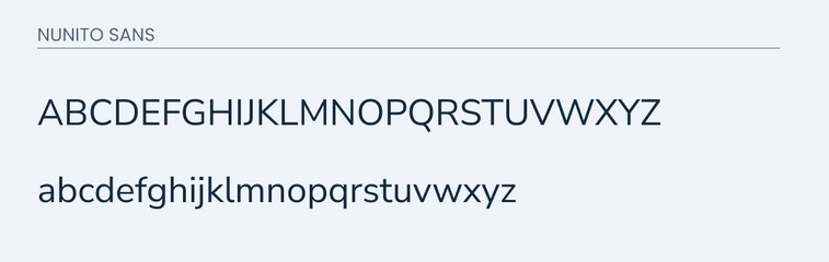
Nunito Sans
Nunito Sans is another great alternative to Proxima Nova because many of the letters give the same look and feel. This typeface is welcoming and friendly. It was created with digital displays in mind. Much like Proxima Nova it works great for both titles and body paragraph texts.
The main differences between the two fonts are curled tail on the "l" in Nunito Sans and the shorter "y". Other major letters are very similar. The "t", "f", and "j" are all almost identical.
This font would be a great choice if you are working on a tight budget.
Compare for yourself below.
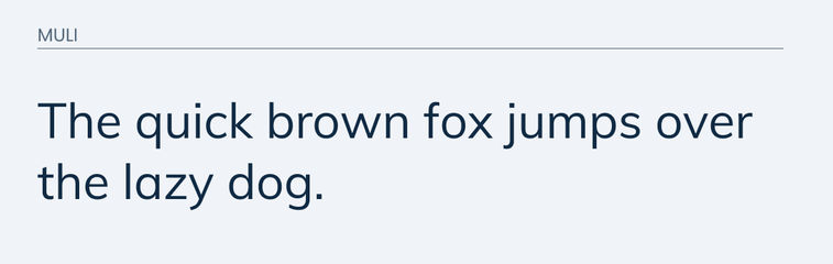
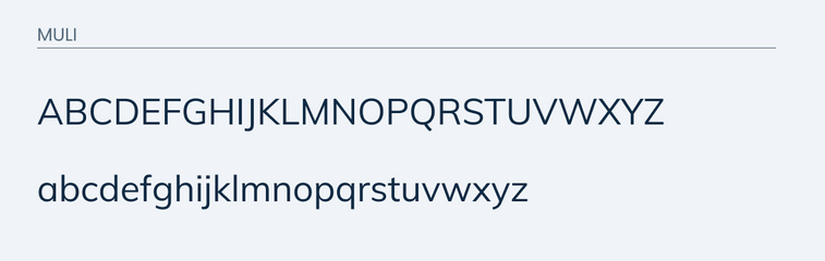
Muli
Muli is another great font that is similar to Proxima Nova. It features a similar look and feel. It is easy to read and approachable.
The major difference is the "a". The "a" in Proxima Nova features a curved "a" with rounded lower half. The "a" in Muli has a straight back and rounded left side.
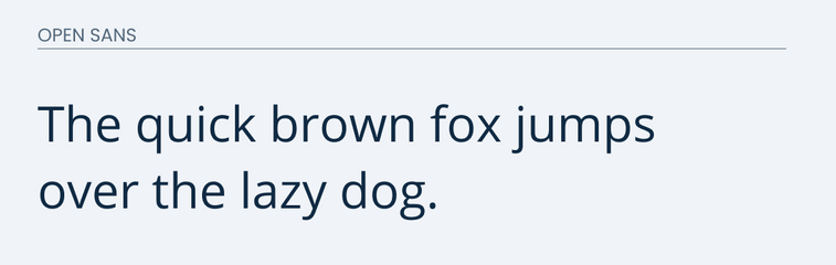
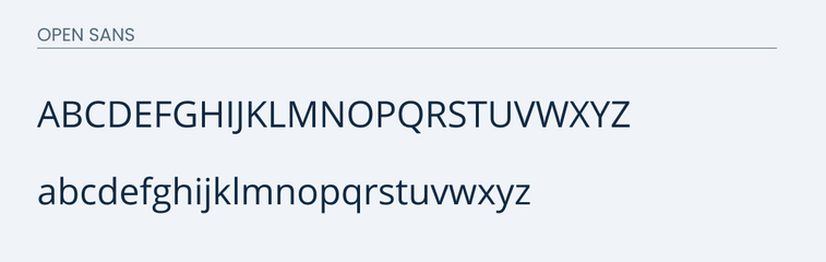
Open Sans
Open Sans is another good alternative if non of the options mentioned above can work. I believe that it has a similar look and feel to Proxima Nova. It gives off the same impressions, but there are a few distinct differences that I should highlight.
The main differences are in the "g" and "c". The "g" in Open Sans features two circles on top of each other with a small tail, but the "g" in Proxima Nova features a open end on the lower end.
The "c" is also difference in Open Sans because it has less of a curve on the back end. The "c" in Proxima Nova is more of a tradition "c".
Compare for yourself.
Conclusion
If you are looking for a different font to use, your best bet will either be Montserrat or Nunito Sans. Some other alternatives are Open Sans and Muli. Either one of these fonts would be great to use if you are on a budget. The best part is that they are all free to use on Google Fonts.